ART 1 FINAL PORTFOLIO
1) This was the most successful project I have done this semester I think. The reason being is Even though the trees in the back ground are alittle messed up now that I look at it the rest of the painting is pretty good. I had to put so many layers of different tones and shades of green in the grass and trees. The reflection of the trees on the water was alittle hard at first because I was afraid the blue would over up the relfection. The focus point of this painting was suppose to be everywhere because thats what it was in the actual picture so I had to dull the building to a different shade of the sky. Under the tree I had to make it alittle darker because it couldnt just be a black shadow because it is a cloudy day. This was a fun project, this was the first project I really liked this semester.This is the Boston Common area as viewed from the bridge.


2) This picture was the one I learned the most on this semester. This really taught me about value and perspective. The thing that was hard about this project is the transfering of the gridded picture to the gridded paper. This drawing is a poleroid camera and at least you can tell what it is. If I did this again I could probably do better knowing the stuff I learned from doing this. The part I didnt get was was I suppose to erase the lines inside because it was suppose to be white. The lens of the camera is alot smaller and higher that its suppose to be but it still looked nice. I thought this project was one that I learned alot from because if I were to do it again I could do better.

3) This project was the worst I think too because it was hard and it didnt come out as I wanted to. None the less this had alot of concepts learned in this class. One was perspective, another was values, another was blending colors. This was suppose to be a perspective drawing so that was a given. The value aspect of it is the items that raise up from the actual game board have to cast some sort of shadow because there has to be a light source. Blending colors was more of blending values then anything. For example if you have the light green and dark green you have to blend them together to give the illusion of a shadow. The picture was suppose to be Star Wars trouble ass you can see in the back ground but it didnt turn out as planned.

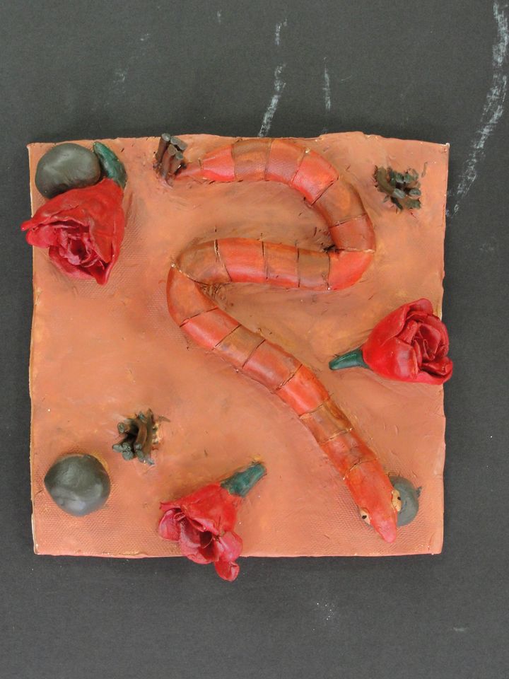
4) Even thought this was probably my favorite project I have done in art class it does have the least amout of learning material for me. The 3D effect of it does already give the shadows and values to it so you dont have to paint those in. Someone said it looked like a snake slithering through the streets in new mexico after a rose parade I liked that so thats what it is. This project has the least learning material in it because you dont really have to apply many things you learned in this class to it. This was one of my favorite projects though it was really fun and showed my artistic talent to an extent. The only thing you had to do was put a base coat on it and paint it what you wanted. I put a base coat of burn seana so it could give the painting that desert feel. This was not a bad project for me it just didnt have much learning concept to it.

5) This project reflects my artistic skill I think even though it is upside down. This one of the more famous russian cathedrals. I wanted the background to be just words like a bible but once I painted over it with water colors and spray painted it that kinda faded away. The only hard part was tracing it from the projector to the paper on the wall. I painted it rainbow in the background because in the actual picture and in real life the buiding is quite colorful since i couldnt paint it to look like that with spray paint I just made it black and the background rainbow. I had no trouble trying to make all the peices stick together because all the peices I needed to cut out were already stuck together. If you could see it up right you can tell what it is. This was a fun project for me too even though I can away with some cuts its all good.