Monday, June 9, 2014

Relief

Develop art making skills
I learned in this project that sometimes you can make a whole bunch of random stuff and put it together to make one awesome thing. Truly I just made the leaves and the tea cup and rat in my spare time I had no intention on putting them together. By doing so I gain familuriority with clay and glaze. Bringing all of these aspects together was a good challenge for my creativity it was like a puzzle.
Problem solving
One problem I had was really putting all of these seemingly random things together to make one. The big mistake was that the glaze didn't stick like I wanted it to on the book so I had to cover it up some how. I figured that since it was a book I could make something on top of it relating to a book I have read. Alice in wonderland came to mind when I did that hence the rat in the tea cup. Also I couldn't have a written anything on the cover since it was all black so I decided to put everything on the top to cover up the horrible glaze job.
Reflect
This whole project was kind of winged not that it was last minute just I made a bunch of random things and they ended up working. I really stepped back and saw what I had done at the very end and I think it was better that way. If it was planned I would have maybe done a better job but I love how it came out. The different leaf colors off the black background and the white, green, and purple tea cup were nice touches. Overall I love how it came out now I just have to glue it.

Wednesday, May 28, 2014

Wearable art

Solve problems
At first I tried to use another cut out but failed because it broke so I did the only other little cut out I could find. The cut out that I chose copied Ms. Sudkamp and I always want to be original but that was okay. Having the initial cut out brake was a big problem but I got past it by making my buttons original.
Analyze
I stepped back and looked at my work when I first got it in the bisque kiln to just see how many there were and how I had to work to glaze them. I didn't nor have i ever really though about how the things i make will turn out i just go with it and when they don't work I'll start over and make a new one. I've always kept my "mess ups" to use in future projects.
Collaboration
I had alot of people working to glaze all of my buttons in 1 day and they all had great feedback. It was kind of cool to be the leader of people which I need to get use to to go into the line of work I want. The people that helped inspired me with their ideas and suggestions.

Unconventional materials

Develop art making skills
I learned in this project that nothing lasts forever also how to create illusions. This piece got torn down by a janitor but it's ok because even though I didn't get a picture it was nice while it lasted. I created an illusion by twirling the computer tape in a spiral so it looks like different circles. I gained skill with the ribbon like material of the tape. I'm use to the ribbon feel but was unfamiliar with the way it bends and such.
Communicate message through art
The message I was trying to deliver was that even though event in life and in history seem insignificant to each other they are all connected in some way. Another ,that was unintentional, is nothing lasts forever. I've learned the second one alot this semester because most of my pieces get destroyed but it helps me learn that message. As for the first one I was thinking that everything really was connected such as the butterfly effect (you kill a butterfly in the past it effects someone being born in the future). This issue is everyone thinks that history is in 1 straight line but it's not its a whole Web that the Nepolian era can connect to the World War I I era.
Collaboration
I definitely had some help from a classmate. Not only did he help me thing of other ways to do it he helped hold things up and keep them in place. Also I had my work right behind the teachers desk so she would critique it and help me in the same way Bailey did. It really helped my creative process having all of the people help me with the spider web.

Thursday, May 15, 2014

Artist

1) Jessica Harrison
     makes porcelain girls in elegant gowns with tattoos all over them
     Scotland
     born in 1982; PhD in sculpture
2) What drew me to this artist is that she takes things that are viewed as elegant and propor and puts a macabre and rebellious twist on them. She is original and executes the point she is trying to covay very well.

Monday, March 24, 2014

After artist

1) My expectations did line up to a very high extent. This was a really fun project and really cool experience. So much so that I have used this for other projects aswell.
2) A struggle I had with this peice is doing the feet. The fabric would not stay wrapped around the wire. I figured out I could use glue to hold the fabric to the wire.
3) A successful peice was adding the accessories to the rat to make it steam punk. I think it gave it that extra wow factor that no one would of thought of.

Vessels

Artist Create Original Art
In this piece I tried to go above and beyond everyone else. Not being limited to just one medium allowed me to do this. When I made this I was thinking about how I could incorperate nature into my piece because there are so many things I could use just outside the door. Even though I have to explain alittle bit how it was a "vessel" it is still a creative piece. I thought it would be really cool to make a real life scene of something that would normally be a picture. Also I thought of what the person I was giving it to would like (that person was Ms. Whiteside). Its a vessel by the wire is holding the raindrops but essentially its not useful.
Artists Develop Art Making Skills
I learned alot from this project. I leanred that hot glue is the best binding medium for fast work. Also I learned that if you cut wood the wrong way it will make a horrid squeak which is helpful because I will probably use wood for future projects. Another thing is proportion even though my project does not have very good proportion it looks well made because of where everything is oriented. I learned that just because something looks good in the piece doesnt mean it should be there. This peice really opened me up to possibilities I didnt think was possible in school.
Artists Reflect
I had to reflect throughout this whole project. When I was making the stand for the cloud I had to measure how tall I wanted the wood to be and how much my platform could take. When I was doing the platform I had to cut the foam core to match the grass just every aspect of this project was planned. I was going to try to cut a big peice of foam and try to pour water in to see if it would give a rain effect but then I saw that it would get everything else in the peice wet and I couldnt have that happen. I tried to put a squirrel in there but it was too big and didnt fit in with the peice. Even though some of thesr ideas didnt work I still made the peice come out to my liking.

Friday, February 7, 2014

Visiting artist

1) Bryant Holsenbeck is an environmental artist that makes natural things out of inorganic items that people usually throw out.
2) My expectations are that she will teach us how to make any animal (since in hindsight all 4 legged animals have basically the same structure) out of basic trash people throw away.
3) I think the project will be confusing at first but once i get the hang of it I will make something really cool.
4) I plan to make a rat or a deer or a fox or a raccoon.


Thursday, January 9, 2014

Book carving

I developed my idea by basing off fear of mirrors and I had this cool idea but it eould take up too much time so I did fear of water and just pained water. If I didnt have abclear plan before starting I would of never know what to do or where to start. Challenges I faced were keeping the layers straight and even and I think it messed up the whole project. I overcame the challenges by trying to make them as straight as possible and trying to ignore the parts I couldnt fix. The design of smaller boxes decending represents how people decend into their fear and once they are down deep into it its hard to get out. My risk was this whole project it was kind of hard because I am a perfectionist and this whole thing was very messy and unorganized. I felt very uneasy about this project I didnt like it very much because it was hard and messy.

Friday, January 3, 2014

Mixed media

1. I showed amusment by having a soldier in a ballet studio dancing with the dancers and most people would find that funny. Ballet dancers are graceful and elegant but soldiers are usually tough and rugged so bringing these 2 elements together makes an amusing peice of work. It is unified because I put elements of a war bunker and a ballet studio so it flows together.
2. Using mixed media came quite simple to me because im so use to doing things like that. I used a mirror, wood models, flower petals, duck tape, paint, and cardboard.
3. The visual journaling mini project didnt really do much of anything for me because my peice didnt have the same elements.
4. One challenge I had was making sure there was enough in there to make it flow. At first there was just the background and the figures but I knew that wasnt enough so I added the baracades and the posters on the walls and it kind of tied it all together.

Tuesday, November 12, 2013

Non traditional portraits

1. I chose the portrait of my cat because I thought it would be easy to do wirh rocks and I love my cat.
2. I chose rocks because they come in different sizes and can be put together easily. The rocks give a texture to the portrait even though its not that detailed you can tell what it is.
3. The risk I took when doing this project is I made it really heavy and only put hot glue but so far it has been doing well. The challenge I faced was actually painting the rocks.
4. There is no connection the the person in the picture and the material used. The rocks made a cool texture I think and make a kind of rugged feel to the portrait.

Thursday, October 17, 2013

Sticky situation

1. How u developed my ideas for "Sticky Situation" is I thought of stiuations that would put someone in a bad spot. I thought of how street artists look when they get caught by the police so I went off if that.
2. I think I was able to go outside of the box in multiple ways. One way was the idea ni one else that I saw had the idea of police finding this elaborate graffiti . The other way is that I didnt just use acrilyc paint I used spray paint too.
3. I was able to show repetition with the different color bricks but alot if them wete covered up by the spray paint.
4. The media I used was acrilyc and spray paint. I did fine with the acrilyc but the spray paint gave me trouble. The trouble the spray paint gave me was mostly my fault I didnt let it dry so it blended the 2 colors I put down.
5. The mimi lessons didnt help me much because I already knew how to use paint and none of the skills we learned were used or supose to be used in me painting.

Wednesday, October 2, 2013

Up Close and Personal

1. Developing my ideas was the hardest part because I wanted to be creative but the only ideas I came up with were pretty generic.  I finally chose the idea I did because I was fed up ttrying to think creatively. The picture I did of the eye with demons in it was pretty unoriginal compared to other ideas but the demons made it creaive.
2. I showed emphasis in this picture by isolating the eye and making it blue to stand out from the skin, the white and red of the eye, and the hair. Also I made it so the eye had black make up on so it would outline the eye even more.
3. I chose to use prisma colors for my medium. The reason being is I could add the detail of the eye without it blending or smudging like the oil or chalk pastels did.
4. The risks I took was making it an edgier subject like you can seem fine but if you look in your eyes you can see your inner demons. Also im usually bad with colored pencil but it kind of worked out this time.
5. I showed emotion in this picture because I made the person with a single tear dripping down like she is tired of her demons. This is a strong picture I think thats why I drew it I want to get a reaction.

Thursday, September 12, 2013

Whats The Point?

1. Some of my solutions for "Whats The Point?" were a knife, space ship, point of a pencil, life, map, glass, and a tunnel
2. I chose a needle, something that doesnt make sense, song lyrics, tunnel, glass, space ship, map, books, knife, and love i chose these items because i thought they were creative and best conveyed the concept of "Whats The Point?"
3. How i showed contrast in my work was i kept the paper i wrote the lyrics on mostly white (except for the shadows of the folds) and colored darker shadows on the original paper.
4. The median i decided to use was pen and pencil. I chose these because pencil is very easy to control especially for shading but the pen would stand out over the pen to create emphasis on the lyrics.
5. The techniques i used in this picture were shading and ink.
6. The only risks i took with this project was the song lyric i wrote. Even though they are from different bands and not myself they are pretty deep. I love my music and i think using it was a creative and good choice.
7. The message i am conveying is that song lyrics have a point because alot of music not a days people always asks "whats the point of this song?". I tried to write down pretty clear lyrics even though you cant read all of what i wrote because of the layering of the paper i did but if you could they would be pretty clear.

Thursday, January 10, 2013

 ART 1 FINAL PORTFOLIO

1) This was the most successful project I have done this semester I think. The reason being is Even though the trees in the back ground are alittle messed up now that I  look at it the rest of the painting is pretty good. I had to put so many layers of different tones and shades of green in the grass and trees. The reflection of the trees on the water was alittle hard at first because I was afraid the blue would over up the relfection. The focus point of this painting was suppose to be everywhere because thats what it was in the actual picture so I had to dull the building to a different shade of the sky. Under the tree I had to make it alittle darker because it couldnt just be a black shadow because it is a cloudy day. This was a fun project, this was the first project I really liked this semester.This is the Boston Common area as viewed from the bridge.
2) This picture was the one I learned the most on this semester. This really taught me about value and perspective. The thing that was hard about this project is the transfering of the gridded picture to the gridded paper. This drawing is a poleroid camera and at least you can tell what it is. If I did this again I could probably do better knowing the stuff I learned from doing this. The part I didnt get was was I suppose to erase the lines inside because it was suppose to be white. The lens of the camera is alot smaller and higher that its suppose to be but it still looked nice. I thought this project was one that I learned alot from because if I were to do it again I could do better.

3) This project was the worst I think too because it was hard and it didnt come out as I wanted to. None the less this had alot of concepts learned in this class. One was perspective, another was values, another was blending colors. This was suppose to be a perspective drawing so that was a given. The value aspect of it is the items that raise up from the actual game board have to cast some sort of shadow because there has to be a light source. Blending colors was more of blending values then anything. For example if you have the light green and dark green you have to blend them together to give the illusion of a shadow. The picture was suppose to be Star Wars trouble ass you can see in the back ground but it didnt turn out as planned.
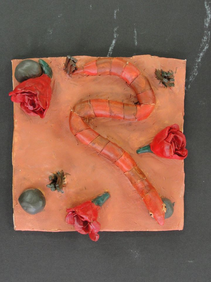
4) Even thought this was probably my favorite project I have done in art class it does have the least amout of learning material for me. The 3D effect of it does already give the shadows and values to it so you dont have to paint those in. Someone said it looked like a snake slithering through the streets in new mexico after a rose parade I liked that so thats what it is. This project has the least learning material in it because you dont really have to apply many things you learned in this class to it. This was one of my favorite projects though it was really fun and showed my artistic talent to an extent. The only thing you had to do was put a base coat on it and paint it what you wanted. I put a base coat of burn seana so it could give the painting that desert feel. This was not a bad project for me it just didnt have much learning concept to it.
5) This project reflects my artistic skill I think even though it is upside down. This one of the more famous russian cathedrals. I wanted the background to be just words like a bible but once I painted over it with water colors and spray painted it that kinda faded away. The only hard part was tracing it from the projector to the paper on the wall. I painted it rainbow in the background because in the actual picture and in real life the buiding is quite colorful since i couldnt paint it to look like that with spray paint I just made it black and the background rainbow. I had no trouble trying to make all the peices stick together because all the peices I needed to cut out were already stuck together. If you could see it up right you can tell what it is. This was a fun project for me too even though I can away with some cuts its all good.

Tuesday, January 8, 2013

i am not going to lie i hated this project. it wold of been fine if we had just colored it in with colored pencil instead of giving it light washes of water color. Water color is very hard to control especially on paper like this. I couldn't get the perspective or shading right either it was very hard. As for the pegs on the board they were very messy. The water color would seep into another color everywhere they touched. i would not recomend this for future classes.


When i was doing the Anamorphosis drawing i had to use Photoshop to make the top larger so when you looked at it at the right angle you could see it is in perspective. I had to make a grid so i could take the transformed picture and put it to scale on the paper. 

The colored pencils anamorphosis had to be a grid in both the actual picture and the drawing. I added shadows and value to make it look like it is coming off of the page. Mine was hard to draw all transformed and stretched but in the end at least you could tell what it is.


The most important part of my drawing is the color I think. It is important because if i didn't have color then you couldn't tell what it was. 

At first drawing the picture from the projector was hard because I could keep the lines straight as I was doing it. As for cutting it out it was pretty easy to follow the lines that I drew. I cut myself a few times but that was okay. from my perspective it looks like Disney World but its a Russian cathedral. I wanted the paper underneath to be all words so its like a bible but when i painted over it it covered up the words. I chose rainbow because the cathedral in real life and in the picture I chose is all sorts of colors so even though i couldn't color in the cathedral i could make the back ground look like it slightly.

Monday, October 22, 2012

1.     Describe the overall composition of your artwork (balance, unity, rhythm and movement). 
    • flows together
    • nice texture
    • nothing blended into the background
      
    2.     How did you add texture and contrast to your print? Is this important? Why?
    •      used thin and thick lines
         Yes, because you cant make the print look like the animal without the lines.
     

    3.     Explain how you used positive and negative space to show your image.
    •      positive
    •           to show the stripes
    •      negitive
    •            to show the background

    4.     Describe the craftsmanship of your print. (How good the project is technically crafted
           Overall I thought it was well put together but I could of used less positive space.

    5.     Were you able to achieve depth by showing a foreground, middle ground and back- ground? Explain.
           Yes because it looks like a swimming fish to me.

    6.     Explain your experience with Printmaking. What were the obstacles and advantages?  
    • disadvantage
    •    no experience
    •    controling the tool
    • advantages
    •     only having to use only one color
    •      having a slightly simple design

    Thursday, October 4, 2012


    1. Explain your experience working on a team and executing your ideas for the mural.
        I think working with a team was pretty easy and it gets work done fast. It was really fun to work with people on the chalk mural because you could interact but work too. The choosing prosses was alittle hard but we got through it.
    2. Explain the importance of collaboration when working on a team.
         If a team doesnt work well together nothing gets done. "a house divided does not stand" said Abraham Lincon and it is true. In order to work well you have to get along.
    3.  How successful was this project? Explain how and why.
         This project was quite successful I think. We worked well together and used our time wisely. we didnt argue at all about what to do or draw we just did what we were told.
    4. Explain how you feel about creating artwork that others can interact with. Ex. Invoving the whole school?
        I think it is fun and a great idea. I reall like art and having people interact with it is even better. It also inspires you to new positions people can do in your art work.
    1. Why is texture so important to have in your sketches?
          Texture is so importent to the sketches because if you dont have texture then when you transfer it over to the actual print the animal wont look like what its suppose to. But if you do have alot of texture then the people that look at your print will know what it is. I think my sketch has alot of texture for just a fish.

    2. Why is it neccessary for you to have several references of each animal and each background? Explain.
          It is neccessary  to have several references of each animal and background because if you think you want to do one and you draw it and then it comes out wierd then you have another to choose. Also if it turns ou that you dont have that much texture in one your doing then you can do another one. Another thing is that you can put the different views of your animal in different background to see if it will look good.

    3. When you look at your sketches are you able to see which sketch is the strongest and will make the best print? How do you know this? 
          If the sketch is just plain and doesnt have much going on then it wont have good texture and it will be hard to make it look like the animal you want when you transfer it to the print. You also have to look at the values. If it has alot of values then it will have good texture but otherwise it wont.